IELTS Training: Ac Writing Task 1
Showing posts with label Ac Writing Task 1. Show all posts

Saturday, May 26, 2018

Academic IELTS Writing task 1 Sample 5

IELTS Academic Writing Task 1/ Graph Writing - Column Graph:

» You should spend about 20 minutes on this task.

The diagram below shows the average hours of unpaid work per week done by people in different categories. (Unpaid work refers to such activities as childcare in the home, housework and gardening.)

Describe the information presented below, comparing results for men and women in the categories shown. Suggest reasons for what you see.
» You should write at least 150 words.
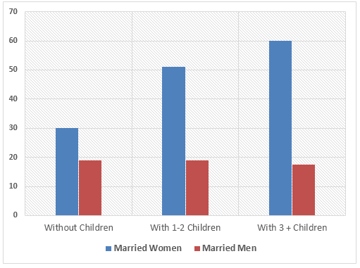
Unpaid work done by people in different categories

Model Answer 1:
The graph shows data between married men and women of the number of hours spent per week on unpaid work. At first glance at the chart, it is noticeable that from all the three categories (without children, with 1-2 children and with 3 or more children), married women spend more hours involved in unpaid work such as housework, gardening and childcare than expected from men.
Married women with children spend more time than without children as the chart shows while having more than three children have invested around 60 hours of unpaid work. This is probably due to the extra load of housework and childcare that is evidently needed to run such a big family.
Furthermore, though there are visible variations of the number of hours of unpaid work carried out by married women, there is no significant variation among all three categories for married men in terms of work hours that are not paid (30 or fewer hours). In fact, it is observed that married men with three or more children spent slightly less number of unpaid work hours. This might be due to the high requirement of commitment needed for a paid job to meet financial requirements for a big family.
In conclusion, married women with three or more children spent the highest number of hours, yet married women from all categories spent a dramatically higher number of hours for unpaid work than married men.
[Written by - Menu Anju ]
Tips for answering this Academic IELTS writing task 1:
1. Look at the question carefully. It asks you to compare the result shown for men and women. So you should not only mention the figures given in the graph. Rather you should use comparisons. An example of comparison is: "The number of unpaid working hours increases for women with the increase of their children's number but that does not affect the total unpaid works done by the men."
2. The question also asks you to suggest reasons for what you see. So you would require giving reasons possibly why the women work more unpaid works that men do and why their working hours in unpaid works increases with the number of total children.
3. There is an interesting fact in the result of the bar graph i.e. men with more than 3 children work even less for the unpaid jobs. Mention this interesting fact in your writing.
4. Since no past year or month is mentioned in this bar graph, your answer should be in present tense. Example: Women spend more time on such unpaid household works than men do.
Summary of the bar graph:
This graph shows the total hour of unpaid jobs like child rearing, household works, cooking, cleaning, gardening etc done by male and female per week. The result of this graph is not related to the paid job of men of women. The result suggests that females spend more time on such jobs than men do. Again, female with more children works more hours than other females. Interestingly the numbers of hours men work in such unpaid works remain almost same regardless of their children number.

Model Answer 2: 
The given column graph elucidates the unpaid work done by both married men and women having different numbers of children. A cursory glance is adequate to mention that most women, with or without children, have to do the unpaid household works more than men and more children mean more work for women.
As is seen in the given illustration, married females who do not have any child do around  30 hours of unpaid work weekly, while,  male from the same category do only 18 hours of such work. Whilst, men who have one or two children spend an equal amount of time for household works as do the males without children, this is in contrast nearly fifty hours for women. In the case of women, who nurture more than three offspring, spend the highest hours on unpaid works -58 hours per week. Men on the other hand, surprisingly do fewer household works with the increase of their child number.
[Word count = 152]

Academic IELTS Writing task 1 Sample 4

IELTS Academic Writing Task 1/ Graph Writing - Bar/Column Graph:

You should spend about 20 minutes on this task.

The chart below shows the amount of leisure time enjoyed by men and women of different employment status.

Write a report for a university lecturer describing the information below.
You should write at least 150 words.

Leisure time in a typical week in hour - by sex and employment status, 1998-99.

Leisure time enjoyed by men & women of different employment status
Model Answer 1:
The provided chart shows the number of leisure hours enjoyed by men and women in a typical week in 1998-99, according to gender and employment status. As is observed from the graph, the unemployed and retired men and women had more leisure time than the other type of people.

Among the full-time employed people, men had about 45 hours of leisure time on an average per week compared to the 38 hours of leisure time for women. No data is given for the part-time employed men and women from this category enjoyed 40 hours of leisure time in a week. This figure is slightly more than the employed women perhaps because of their employment nature.

Unemployed and retired people had the longest period of leisure activity both for men and women and men had a bit more hours than the women. As expected the retired and unemployed people enjoyed about 78 to 82 hours per week which is longer than people from other employment statuses. Lastly, housewives enjoyed approximately 50 hours of leisure time which is more than the employed women but less than the unemployed and retired women. The graph reflects that men had more leisure time from all employment statuses than women which indicates that women spent more time working at home than their male counterparts.

The graph summarises that the male enjoyed more leisure time than women and employed people had less time for leisure activities than retired and unemployed people. 
(Approximately 244 words)

Sample Answer 2:  
The graph compares the amount of leisure time enjoyed by people of different employment levels in a typical week in the year 1998-1999.
In the given column graph, no data has been provided for the part-time employed and house-staying men. For rest of the cases, Men have more leisure time than women of the same category.  The highest amount of leisure hours is enjoyed by those, who are unemployed. Unemployed men had approximately 85 hours of spare time and women from the same category had about 83 hours. The retired people also enjoyed the same amount of leisure activities as did the unemployed men and women.  On the contrary, full-time employed men had a total of 40 hours leisure time compared to about 37 hours of women from the same status. Finally, women with part-time jobs had 40 hours to spend for their leisure activities and housewives had 50 hours leisure time per week.In conclusion, unemployed and retired people, both men and women enjoyed more leisure time than employed people and men compared to women had more time for leisure activities. 
(Approximately 181 words

Academic IELTS Writing task 1 Sample 3

IELTS Academic Writing Task 1/ Graph Writing - Line Graph:

» You should spend about 20 minutes on this task.

Eating sweet foods produces acid in the mouth, which can cause tooth decay. (High acid levels are measured by low pH values)

Describe the information below and discuss the implications for dental health.
» Write at least 150 words. 
Acid level in mouth from consumption of sugar/honey
Sample answer 1:
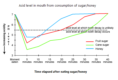
The provided line graph illustrates the acid level in the mouth which is created by consuming sweet foods specifically sugar and honey and the possibility of tooth decay because of this acid level. As is presented in the line-graph, the higher the acid level the lower the pH value and a pH level less than 5.5 is detrimental to the tooth and causes the tooth decay.

The given graph shows that the initial pH level of our mouth is 7 which begins to fall after consuming sweet foods. When we eat sweet item like cane sugar, the pH level drops to 3.5 after 5 minutes and remain in danger level (below pH level 5.5) for more than 30 minutes. Consuming fruit sugar drops the pH level nearly to 4 and remains at danger level for about 20 minutes. And finally, when we eat honey, the pH level falls below 5 and it remains under risk level for about 13 minutes. As the low pH level means higher acidity and causes tooth decay, cane sugar among the mentioned three food items is the most harmful to our tooth.
(Approximately 186 words)  

Sample Answer 2:
The provided line graph shows the acid level of our mouth which is created by the consumption of fruit sugar, cane sugar & honey and compares their effects on our tooth decay.
When the pH level in the mouth is above 5.5, acidity remains at such a level that teeth are unlikely to be in danger from decay. Sweet foods, however, cause pH in the mouth to drop for a time, and the longer the pH levels remain below 5.5, the greater the possibility for decay to occur. The illustration compares the fruit sugar, cane sugar and honey, which are the most common ingredients of sweet foods, causes the pH level to drop below the danger level after 5 minutes.

Among these 3 sweet items, cane sugar decreases the pH level most quickly and causes to remain the level under the danger level for the longest period (over 30 minutes) and thus produce the greatest risk among the three. After consuming the cane sugar, the pH level drops to level 3.5 and remains there for over half an hour. On the other hand, fruit sugar causes the acidity level of mouth to fall under pH level 4 in 5 minutes and remains under threat level for 20 minutes. Finally, the honey appears to be less risky among the three causes the pH level to drop to 4.7 in 5 minutes and proceed to above pH 5.5 level within 15 minutes of consumption.

In conclusion, all of the sweet items possess the possibility of causing tooth decay and honey and fruit sugar are likely to cause less decay than the cane sugar does.
(Approximately 271 words)
These 2 model answers can be followed as examples of standard answers. However, please note there are other good ways of writing a possible good answer.)
Tips for answering this Writing Task 1 Question:
1. Please note that the question asks you to "describe the information presented in the graph and also discuss the implications for dental health". So you have to mention which food item creates the highest acid level for a longer time and are comparatively injurious to our teeth. You must classify which food items are comparatively safe as well. First, compare the three food items in terms of the acid level they create in our mouth and how long this acid level remains at danger level. Then suggest which food items among cane sugar, fruit sugar and honey are comparatively safer and which item/ items are not.

2. Notice the following trends from the given line graphs:
    a) Higher the acid level, the lower the pH level.
    b) pH level below 5.5 is dangerous for the tooth as the tooth decay occurs below 5.5 pH level.
    c) Honey is comparatively safer than other two food items as it decreases the pH level of the mouth slowly and the acid level goes to the safe level very quickly. On the other hand, after consuming cane sugar the pH level falls under danger level quickly and remains there for the longest time among the three food items.

3. To answer this question first mention the acid / pH level which occurs the tooth decay and the level when it is safe. Now take the three given food items and mention them individually: how long it takes to reach the pH level of mouth below 5.5 after consuming this food item and then how long this level remains under 5.5. Finally, suggest which food items are comparatively safer and which are not. 
Summary of the Line Graph:
After consuming different sweet food items, the acid level of our mouth increases. The higher acid level is presented by the lower pH value. When the pH value gets under 5.5, the tooth decay occurs. Among the given three food items i.e. cane sugar, fruit sugar and honey, the third item (honey) is comparatively safer for our dental health. This is because after consuming all the honey the pH level remains at danger level for about 12 minutes compared to the 20 minutes for the fruit sugar and 31 minutes for cane sugar. This also indicates that the cane sugar is more likely to damage our tooth among the provided three sweet food items.

Academic IELTS Writing task 1 Sample 2

IELTS Academic Writing Task 1/ Graph Writing - Line Graph:

» You should spend about 20 minutes on this task.

The graphs below show the numbers of male and female workers in 1975 and 1995 in several employment sectors of the Republic of Freedonia.

Write a report for a university teacher describing the information shown.
» You should write at least 150 words.

Male and female workers in 1975 in Freedonia
Male and female workers in 1995 in Freedonia

_________________________________________________________________________

Sample Answer 1:
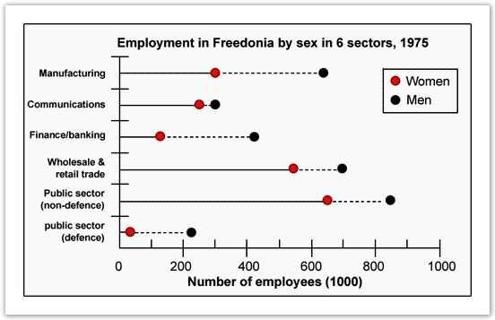
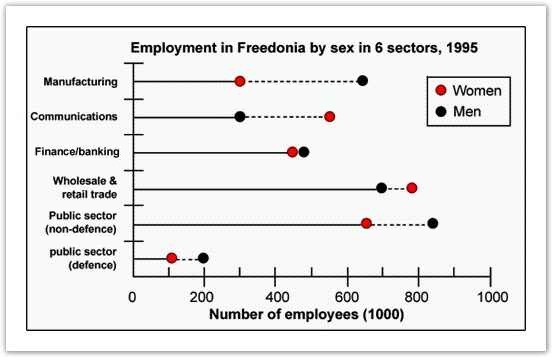
The diagrams compare the male and female employment status in six different job sectors in two different years – 1975 & 1995. As is seen from the given illustration, men were well ahead of women in all the job sectors in Freedonia in 1975. However, the scenario changed in the 1995 and women did a remarkable progress in their professions.
According to the given diagrams, men in Freedonia were well ahead of females in manufacturing, finance/banking, wholesale & retail trade, defence and non-defence sectors. In manufacturing, more than 600 male employees could be seen against only 300 female employees out of a thousand employees. Except in communication sector, the proportion of male employees was far greater than that of females. Among the given job sectors, the public /non-defence sector had the highest number of employees while the defence sector had the least number of employees.
After 20 years, women showed an outstanding advancement in the job sectors and they went well ahead of men in communication, wholesale & retail trade sectors. They become almost equal in number in finance and banking jobs while the gap between male and female employees’ numbers reduced in defence jobs. The only sector that was still male dominant was manufacturing and the job ratio in this sector remained almost same as it was 20 years earlier.

Sample Answer 2: 
The line graphs show the information about employment scenario in Fredonia by gender in six different employment sectors during 1975 and 1995. It is very clear from the overall trend that men were pretty much dominating the job markets both during 1975 and 1995, but women made progress in the given 20 years period.

According to the first graph that depicts the employment status in 1975, there were far more male employees in all the employment sectors than its opposite sex. Nearly half of the employees in the manufacturing industry were men. Most strikingly, 75% of financial sector employees were male. However, women appeared to be competing for shoulder to shoulder against their male counterpart in the communication sectors.

Turning to the 1995 data, females had made a significant improvement in securing jobs in different employment sectors. On top of that, women outmatched the male counterpart in securing jobs in communication and wholesale & retail trade industry. Furthermore, nearly half of the communication sector employees were women. In finance sector as well, women were not very far behind.

Comparing the two graphs, it seems very clear that in between those twenty years the number of male employees in these sectors had remained considerably the same, but there was a considerable increase of female employees in the majority of these job sectors.

Academic IELTS Writing task 1

IELTS Academic Writing Task 1/ Graph Writing - Column Graph/ Bar Graph:

 You should spend about 20 minutes on this task.

The chart shows the number of mobile phones and landlines per 100 people in selected countries.

Write a report for a university lecturer describing the information given.
» You should write at least 150 words.
The number of mobile phones and landlines per 100 people

Model Answer 1:
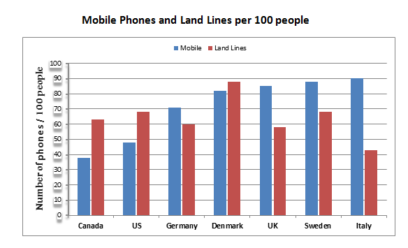
The supplied bar graph shows data on the number of cell phone and land phone users in seven countries in the Europe and the American regions. As is observed from the presentation,  the number of landline users in Denmark, US and Canada are higher than the number of cell phone users in these countries. On the contrary, in Italy, Sweden, Denmark and Germany the cell phone users are higher in number than that of land phone users.
In Italy, Sweden, UK and Denmark almost 80-90 percent people use the cell phone. Among these six countries, Italian people are highest in percent in terms of cell phone usages whereas the highest percentages of land phone users are found in Denmark which is almost 90%. The difference between cell phone and land phone users is highest in Italy and in Denmark. The lowest number of land phone users can be found in Canada.

In summary, North America has more land phone users than their cell phone users and most of the European people prefer to use mobile phones over land phones.
(Approximately 187 words)   
Tips for answering this writing question:
1.  The graph does not mention any year from past so your answer should be in present tense. Example: Around 70% German people use mobile phones whereas the land phone users of this country are 60%.
2. Notice the fact that, in USA, Canada and Denmark, the number of land phone users is higher than the mobile phone users. In other four European countries, the opposite trends can be observed where cell phone users are more than the land phone users.
3. The data are given in percentage so mention them as percentages, not in an absolute value.
4. No past year is mentioned in the illustration, so use the present tense to present your writing. Example: 90% Italian people use cell phone whereas only 41% of them use the landlines.
5. Mention which countries have the highest and lowest land phone and cell phone using percentage in your answer as these are two important facts are present in the graph. For instance: The highest percentage of cell phone users are Italian whereas their percentage of using the land phone is lowest among the given countries. On the contrary, Denmark has the highest percentage of land phone users and this percentage is lowest in Canada.
Summary of the bar graph:
The given graph compares the percentages of land phone and cell phone users in 7 different European and American countries. As is given in the illustration, the numbers of cell phone users are higher than the land phone users are in Italy, Sweden, UK and Germany. On the contrary, the land phone users are higher than cell phone users are in Canada, US and Denmark. Also, Italy has the highest percentage of mobile phone users and also the lowest land phone users. Finally, Denmark has the highest percentage of landline users and Canada has the lowest percentage of land phone users among the given 7 countries.
Sample Answer 2:
The given illustration gives data on the number of mobiles and land phone users in six different countries namely: Canada, US, Germany, Denmark, UK, Sweden and Italy.
As is presented in the chart Canada, US and Denmark have more landline users than the cell phone users while the opposite is true for Germany, UK, Sweden and Italy where the cell phone users exceed the number of land phone users. In Canada, the US and Denmark the numbers of cell phone users per 100 are consecutively 38, 48 and 71 while the landline users are 61, 38 and 87. On the other hand, the remaining 4 countries have much more mobile phone users than the landline users. The Italian people use the highest percentage of land phones and lowest percentage of cell phones on an average. On the contrary, Canadians use the lowest number of cell phones per 100 people while the mobiles phone users are almost half of the total land phone users.

In summary, US and Canada have higher land phone users than the cell phone users while the European prefers to use cell phones than the land phones.
(Approximately 191 words)